
 Postman
WYSIWYG Doc Editor
A rich text editor capable of instantly rendering Markdown, in addition to formatting rich media within documentation.
About Postman documentation
Postman is a platform for building and testing APIs. Documentation is how teams onboard each other onto those APIs.
But authoring was gated behind Markdown. Writing docs meant a loop, three steps for every paragraph:
Memorize the syntax before you can write anything at all.
Write blind, trusting the raw syntax renders the way you mean it to.
Flip to a separate view just to confirm it actually did.
That loop is fine for technical writers. For everyone else who maintains docs, it’s a hurdle just to format a paragraph.
I led the design of an editor that removed the loop, serving power users, intermediate users, and novices from one surface, while keeping every existing Markdown workflow intact.
Markdown is integral to API schemas - the blueprint that governs API definitions, so deprecating it was out of the question. The ask was to figure out a way to broaden usability across the board for all persona archetypes, without losing the essence of formatting for existing users. New editors usually arrive with a wave of support tickets: controls move and the layout feels unfamiliar. We needed to avoid that. The sections below walk the problem, the personas it had to serve, and the decisions that shaped the editor.
Markdown issues
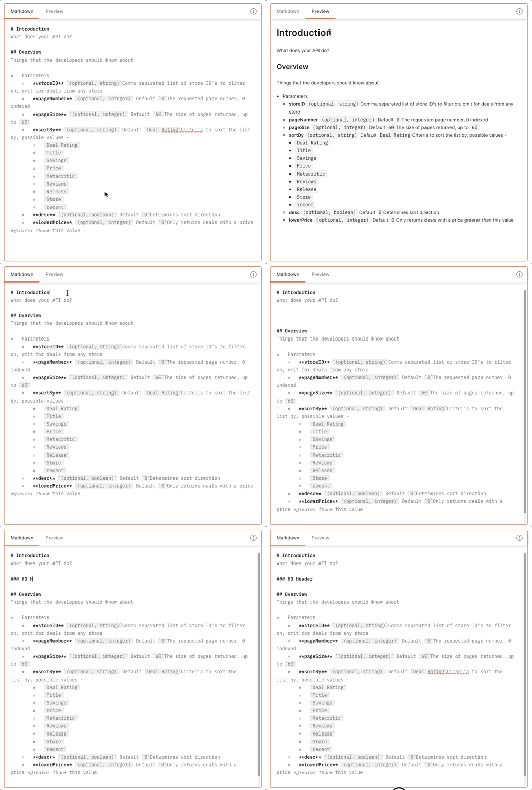
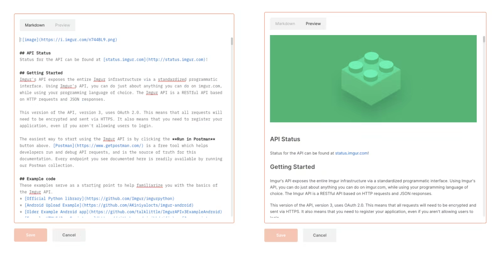
The cost of syntax
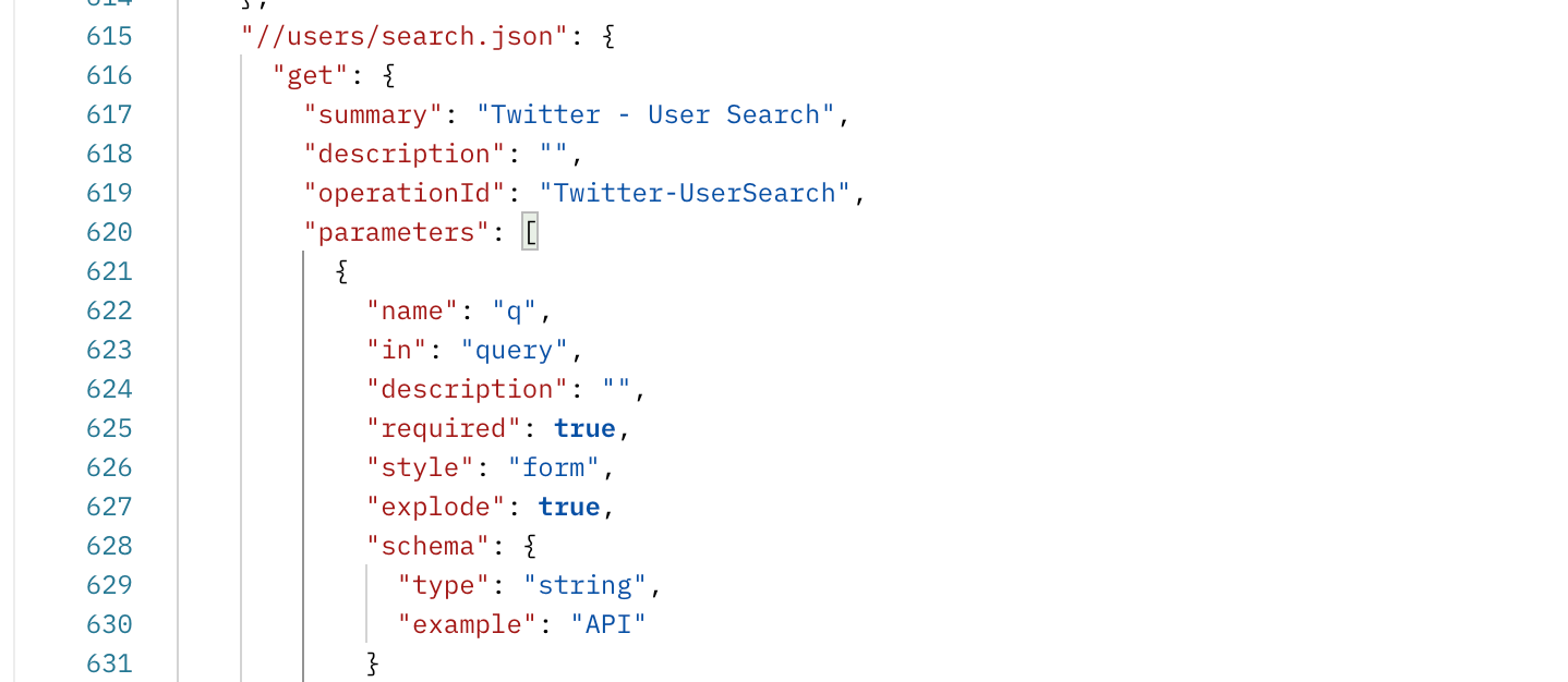
Legacy API documentation lives in schema annotations and, increasingly, in Postman Collections that act as a single source of truth. Almost all of it is authored in Markdown. Markdown is lightweight and renders everywhere, which is exactly why it persists, but it asks the author to visualize the output while typing it, and to break their flow to verify it. Conventionally, technical writers generated documentation; but as dev tooling democratized, everyone, engineers, QA, community, even legal, was expected to contribute, and most of them don’t think in syntax.
Novices bounced to the preview tab constantly, just to see what their Markdown had actually produced. Seasoned authors made the same trip nearly as often, especially for complex content like tables.
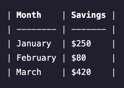
The objective: an editor that works for any skill level and doesn’t depend on knowing Markdown, without breaking existing workflows. If formatting rendered as you typed, the “Learn” and “Preview” steps mostly disappeared, and so did the barrier to entry that was costing documentation its potential authors.
Three personas
The challenge was creating an editing experience that caters to all skill levels, without disrupting the workflows of existing users and compromising on the muscle memory and mental models.
Power users
Technical writers, developer relations, old-school SDEs.
Documentation is a daily task; they’re unfazed by Markdown, the syntax is familiar, and they’re keyboard-first.
Intermediate users
Community managers and SDEs.
At home in Notion, Confluence, Medium; they reach for a rich-text toolbar for the complex things (image embedding), lean on keyboard shortcuts, and know Markdown if forced to.
Novices
QA, certain buyers like legal, newer SDEs, content and brand writers.
They format almost everything through the toolbar and would otherwise have to keep a Markdown cheat-sheet open to compose anything.
trigger
(Live Preview Rendering)
The hypothesis
A hybrid workflow is the middle ground for all three. Novices get the full benefit of the toolbar, with an experience similar to any other text editor; intermediate users, familiar with workflows like Notion and Roam, get the instant formatting they’re already used to, with the added support of the RTE toolbar; and power users keep formatting entirely from the keyboard, as they always have.
Decisions
#1, Keep Markdown
The tension. A greenfield rich-text framework would have been cleaner to build and easier to extend. Markdown carried legacy baggage and ambiguous edge cases.
The call. Keep Markdown as the substrate. People had authored in it for years (if it ain’t broke), it offers just enough formatting without demanding much effort, an overwhelming majority of OpenAPI schemas already carry Markdown descriptions, and the current Collection format supported Markdown out of the box. Dropping it would have broken existing content and frustrated the people who wrote it.
The tradeoff. I inherited Markdown’s messiness, as many formatting permutations as there are authors, and had to design a ruleset reliable enough to render all the sensible ones predictably, rather than a clean framework I fully controlled.
#2, Backwards compatibility
The tension. The fastest way to ship was to support the formatting that mapped cleanly and skip the awkward cases. But every skipped case meant someone’s existing document would break.
The call. Support everything that already works. That was the core requirement of the spec. I built the content framework from first principles.
The tradeoff. Far more upfront specification work, enumerating every case and defining nesting rules, in exchange for an editor existing authors could trust on day one. The curveballs still had to be answered by hand: what happens when you backspace into a block? when one block type is pasted into another?
Defining frameworks
Framing the framework meant reasoning across several axes at once:
Components supported by Markdown
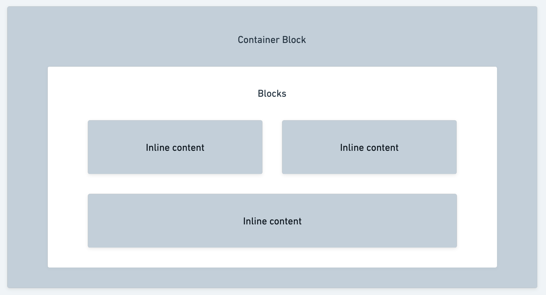
Markdown lets some content types nest within others but not vice versa, so I mapped the whole surface into two types, blocks (full-width components) and inline (flexi-width components), and the rules that govern how they combine: inline can nest with inline, blocks can nest within blocks, inline can live inside a block, but not the reverse. Markdown has almost as many variations as it has authors, and every one had to fit somewhere in the new model.
Block elements
- Line separators
- Headings
- Code blocks
- Paragraphs
- Tables
- Blockquotes
- List items
- Images
Inline formatting
- Codespan
- Bold
- Italics
- Strikethrough
- Link
Enumerating the permutations and encoding those nesting rules let the editor accommodate the real-world combinations authors already used, and then some.
Hierarchies of abstractions
A small set of primitives, block and inline, sit at the bottom, and everything else composes from them rather than earning bespoke, one-off logic. A table is built from the same parts: rows of blocks holding inline content, following the same nesting rules. Adding a new component means combining existing primitives, with no new parser logic.
Extent of RTE functionality
Capability-wise, the surface it needs to cover:
- Responsiveness. The editor turns up in different widths and contexts across the product, so nothing can assume a fixed viewport; the toolbar and its affordances have to adapt instead of overflowing or breaking.
- Toolbar access. A dependable set of formatting controls always within reach, the fallback every persona leans on when a shortcut or a typed trigger doesn’t land.
- Shortcuts. Every semantic action needs a keyboard binding that doesn’t collide with system or browser shortcuts, matching the muscle memory people already carry in from other editors.
- Image manipulation. Inserting an image can’t be the end of it; resizing, alignment, and swapping the source all have to stay possible after the fact, not just at insert time.
- Clipboard sentience (Ctrl+C, Ctrl+X, Ctrl+V). The editor has to know what’s actually on the clipboard, not paste blindly; rich content lands as rendered content, raw Markdown gets parsed, and cutting preserves that same fidelity on the way back in.
- Editor state management (Ctrl+Z, Ctrl+Shift+Z). Formatting, inline edits, and structural changes all move through the same undo history, not the browser’s own patchy native undo.
- Embedding iframes. Documentation regularly needs live, external content, not just static text and images, so the block model has to account for an element it doesn’t fully control.
- Nesting blocks, sensibly. Blocks can contain blocks, but not arbitrarily; a blockquote holding a table holding a list needs defined limits, or the ruleset breaks under its own permutations.
- Editing inserted elements. Once a table or an embed exists on the page, authors need to go back in and change it, not delete and re-insert from scratch every time.
- Keyboard navigability. Moving through tables, blocks, and nested content by keyboard alone, not just typing inside one line; arrow keys and tab need real, predictable behavior.
- Drag and drop. Reordering blocks, or dropping an image straight from the desktop, without forcing authors through a separate upload flow first.
Real-time component injection triggers
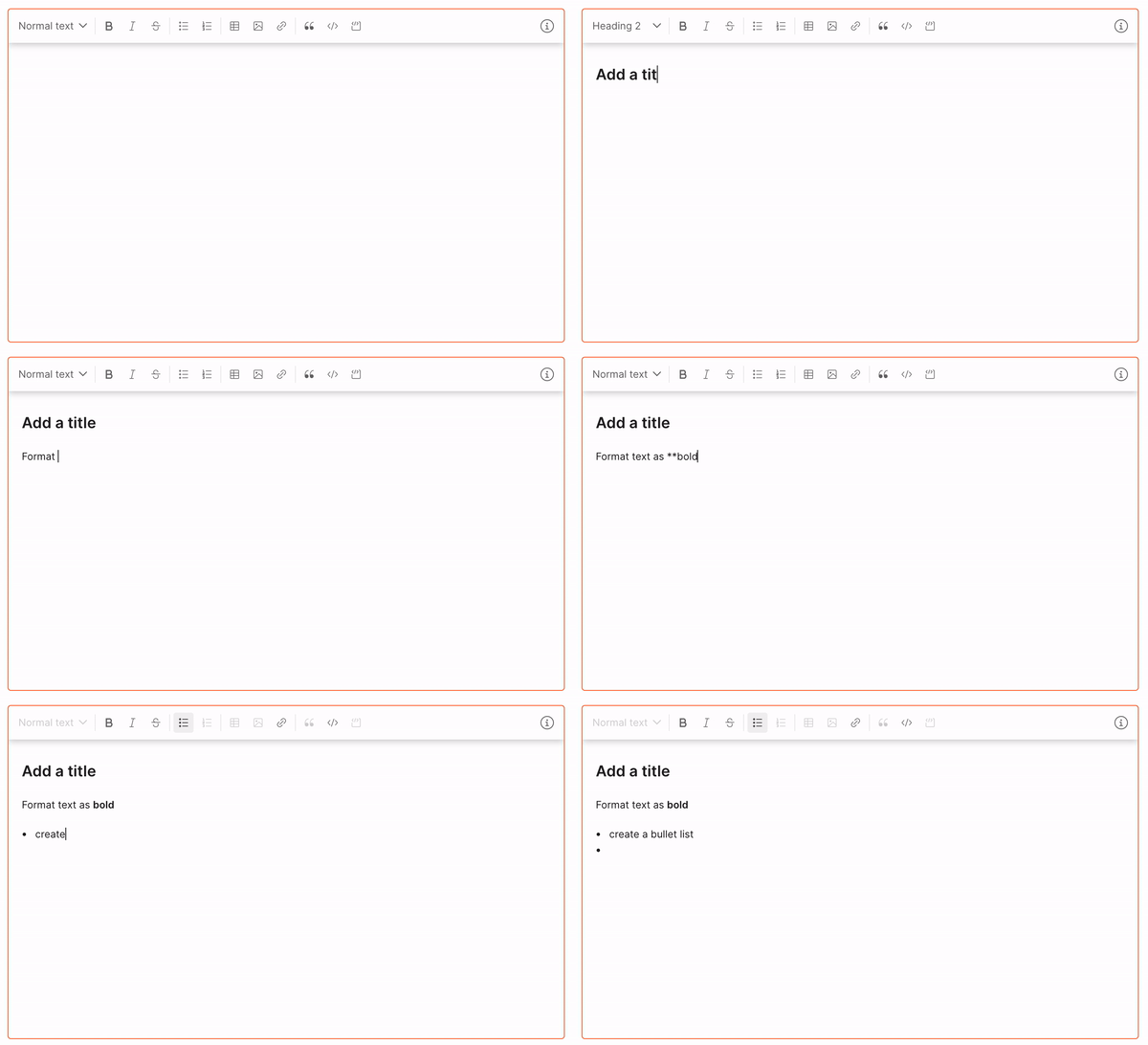
The same two cues from real-time rendering, prefix-only and prefix-and-suffix, cover the full trigger set. Each one plays out live on the right, typed input on the left, the accepting keystroke on the right:
Prefix-only
Heading
# through #####, followed by Space, instantly formats an H1 through H5.
Bulleted list
- or *, followed by Space, starts a bulleted list.
Numbered list
1., followed by Space, starts a numbered list.
Blockquote
>, followed by Space, starts a blockquote.
Code block
Three backticks open a code block - the third ` fires it.
Horizontal rule
--- draws a line separator - the third - fires it.
Prefix-and-suffix
Link
[ auto-prompts the closing ]; Tab accepts it, then auto-prompts (; Tab accepts that, then
auto-prompts ), completing a link.
Image
![ follows the same bracket-then-paren Tab-accept routine as a link, for an image.
Bold
** auto-prompts the closing **; Tab accepts and renders bold.
Italic
* or _ auto-prompts the closing mark; Tab accepts and renders italic.
Strikethrough
~ auto-prompts the closing ~; Tab accepts and renders strikethrough.
Inline code
` auto-prompts the closing `; Tab accepts and renders inline code.
Keyboard shortcuts
The same actions, bound to shortcuts that don’t collide with the browser or the OS. Shown for macOS;
Windows swaps ⌘ for Ctrl and ⌥ for Alt.
| Markdown trigger | Keyboard shortcut | Formatting |
|---|---|---|
**text** | ⌘ + B | Bold |
*text* or _text_ | ⌘ + I | Italic |
~text~ | ⌘ + ⇧ + S | Strikethrough |
- or * + Space | ⌘ + ⇧ + 8 | Bulleted list |
1. + Space | ⌘ + ⇧ + 7 | Numbered list |
| - | ⌥ + ⇧ + 0 | Normal text |
# + Space | ⌥ + ⇧ + 1 | Heading 1 |
## + Space | ⌥ + ⇧ + 2 | Heading 2 |
### + Space | ⌥ + ⇧ + 3 | Heading 3 |
#### + Space | ⌥ + ⇧ + 4 | Heading 4 |
##### + Space | ⌥ + ⇧ + 5 | Heading 5 |
| - | ⌥ + ⇧ + 6 | Heading 6 |
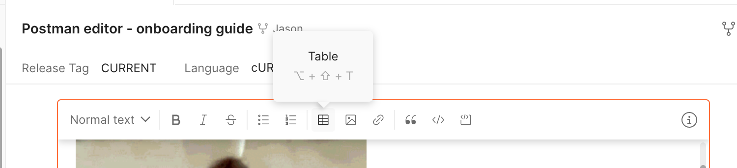
| - | - | Table |
![ | - | Image |
[ | ⌘ + K | Add link |
> + Space | ⌘ + ⇧ + . | Blockquote |
` | ⌘ + ⇧ + M | Codespan |
``` | - | Codeblock |
The proposal
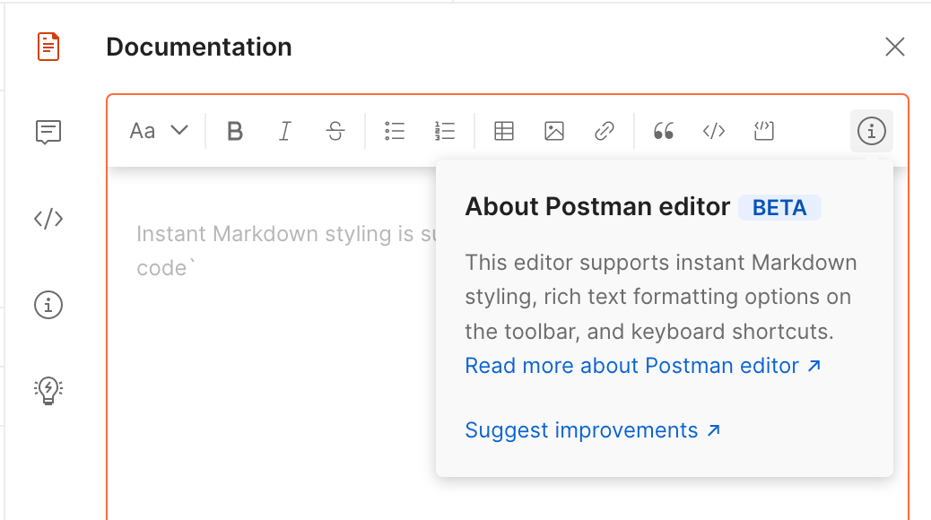
Real-time rendering
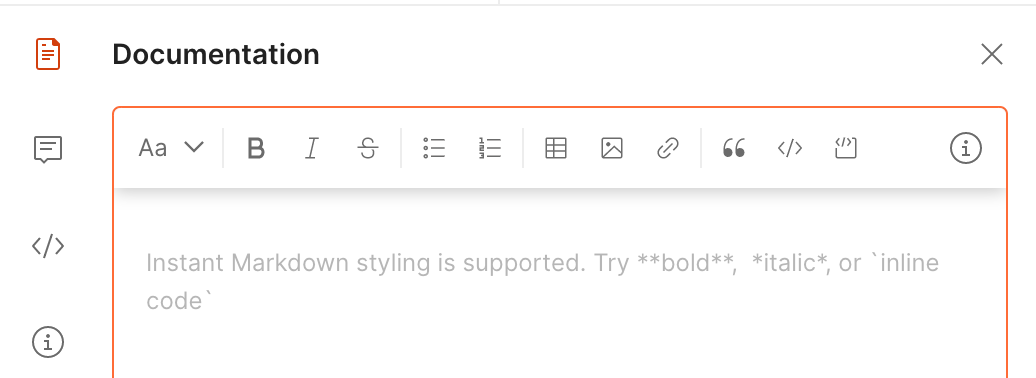
The editor renders formatting the moment it can confirm a match, so there’s nothing to preview. That relies on
pattern recognition reading two kinds of cues: prefix-only triggers (## opens an H2; a hyphen-then-space
starts a list) and prefix-and-suffix triggers (the closing ** confirms and renders bold). This was the big
change from Editor v1.0, a basic rich-text editor where authors still had to switch between edit and preview to judge how their content would render.
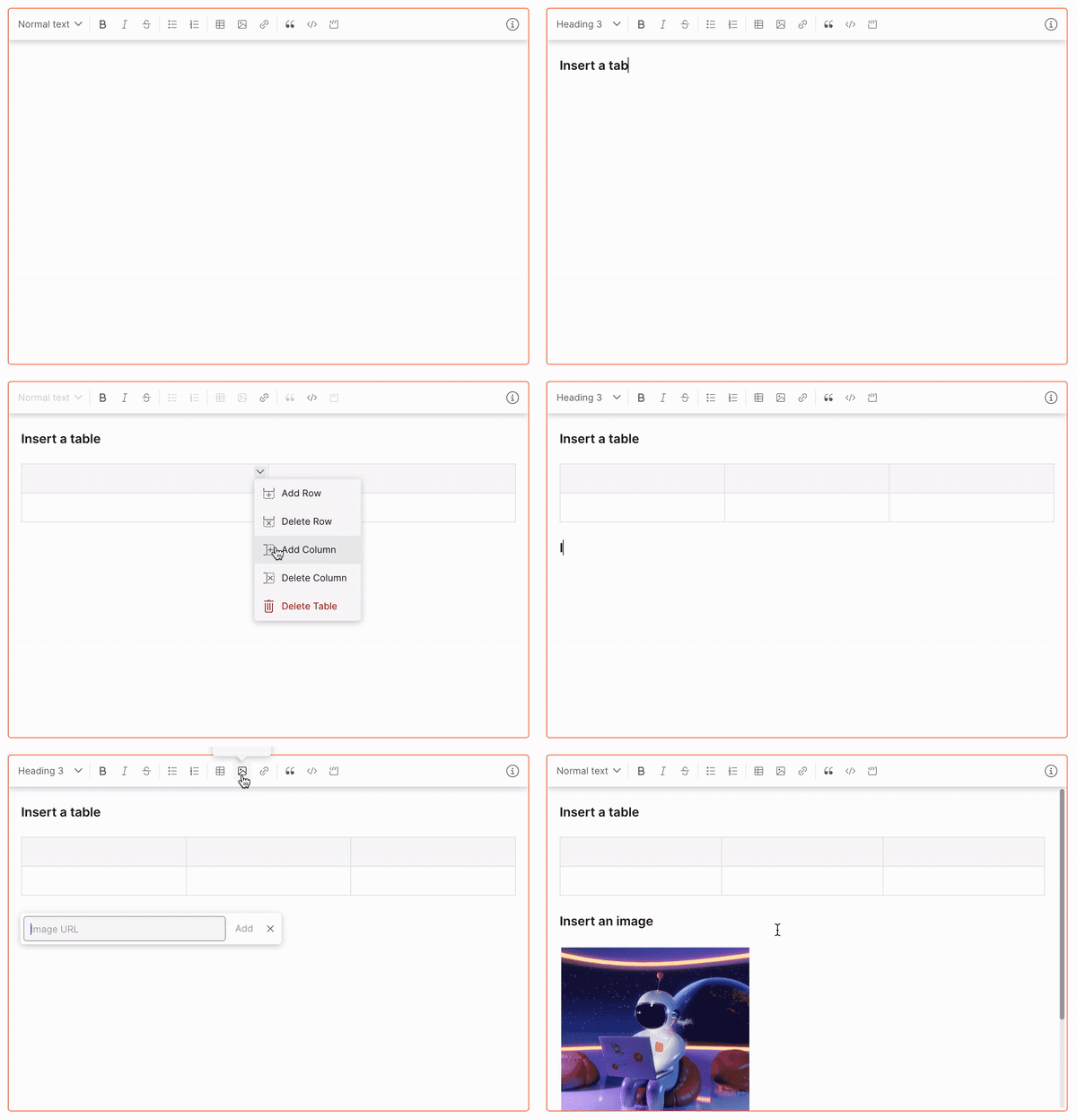
The upgrades over the legacy editor concentrated on what Markdown made tedious: intuitive tables, and far simpler link and image insertion (images fetched and rendered right in edit mode); real-time rendering with no preview; broader keyboard accessibility, most formatting carries a shortcut, and you can navigate through tables and blocks by keyboard; paste that respects its source, whether rich content or raw Markdown; and code-block syntax highlighting.
The hard edges
A few problems mattered more than the rest. Getting them wrong would have lost users faster than any missing feature:
- Keyboard accessibility. Every semantic action needed a shortcut that didn’t collide with system or global
app shortcuts, and that respected the mental models people already carry from commonplace text editors. If a
shortcut like
Cmd+Bdid something unexpected, people would report it as a bug. - Detecting complex Markdown combinations. Detecting the trigger for nested or combined syntax was the hardest engineering problem. Once I’d studied how authors actually typed formatting out, I could articulate the exact cues the editor engine watches for to start rendering, instead of guessing at parse time.
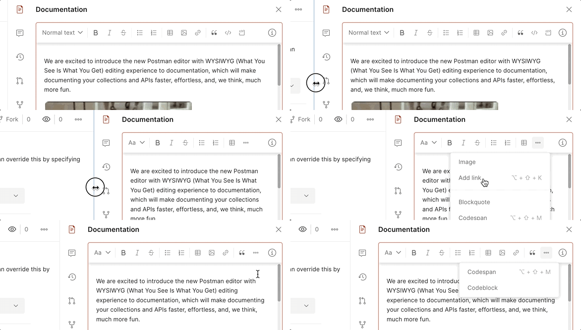
- Native responsiveness. The editor would surface in many places across the product, so I designed for different breakpoints and built icon elasticity into the toolbar, affordances that adapt to touch displays and cursor interactions rather than fragmenting into per-surface variants.
- Tables. Tables had the most states and interactions of anything, the most nuance to account for. As with the rest of the editor, once the building blocks were right, the work was listing every interaction and defining each one.
Decision 3, Toolbar and failsafe
The tension. This editor would live across the whole product, in surfaces of different widths and contexts. A breakpoint-driven toolbar would be brittle and inconsistent. And any new editor, however carefully specced, can hit a fatal edge case on someone’s real document.
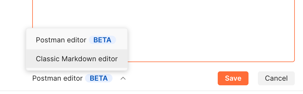
The call. Three moves. First, an extensible, configurable toolbar that doesn’t depend on breakpoints to stay usable: each surface configures which functionality the editor exposes, so the same component adapts to context instead of fragmenting into variants. Second, design for learnability, the UX is built to onboard authors and move them toward fluency without the toolbar, with an in-product feedback channel so the community could flag issues we triaged and fixed as we went (we learned alongside them). Third, a failsafe: authors could switch back to the classic Markdown editor at any time, and, importantly, enterprise organizations could set the default editor experience for their whole team.
The tradeoff. Offering an escape hatch risks authors retreating to the familiar tool instead of adopting the new one. I accepted that risk. The fallback made it safe to turn the new editor on by default, and the learning prompts and feedback loop encouraged people to stay.
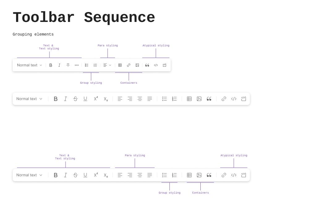
Toolbar responsiveness
The tension. “Icon elasticity” was the promise made earlier: the same toolbar had to surface everywhere the editor did, a full-page document, a narrow comment box, an embedded modal, without fragmenting into per-surface variants. A toolbar that just wraps or clips at arbitrary widths reads as broken, not adaptive, and a bespoke layout for every host surface was never going to scale past the first few integrations.
The call. Progressive truncation, in a fixed priority order. First the text-style label shrinks from “Normal text” to “Aa”. Past that, tools fold into an overflow menu lowest-frequency first: block-level inserts (blockquote, codespan, codeblock) go first, then image and link, while the tools authors reach for constantly, bold, italic, strikethrough, both list types, stay on the bar down to the narrowest width the editor supports. Every hidden action keeps its own row in the overflow menu, with its shortcut, so nothing becomes unreachable.
The tradeoff. An overflow menu is still an extra click for whatever’s inside it, and at the narrowest widths, more than half the toolbar lives behind that click. I accepted that cost in exchange for a bar that never wraps to a second row or clips a button in half, and the collapse order is what keeps the cost proportional: the actions that fold away first are the ones an author reaches for least.
Outcome
Nobody had to relearn anything. Experienced authors stopped switching to preview, and everyone else no longer needed to know Markdown. Shipped BETA-flagged with a failsafe and an instrumented feedback loop, the signal that mattered was retention: document edits rose, and the overwhelming majority of authors stayed on the new editor rather than rolling back to Markdown-only. Power users kept every workflow they had. (Outcomes directional; exact figures confidential.)
Sweating the details
Rich text editors are familiar to everyone, so ours had to work flawlessly. Any new interaction or hidden affordance would have been obvious, and would have hurt the product’s credibility. Building it from the ground up, rather than adopting an existing library, bought three things:
- Pasting Markdown converts it to rendered output instantly.
- It behaves as a true WYSIWYG editor.
- It’s backwards compatible: every existing Postman Collection still parses.
That let us focus on studying how existing WYSIWYG editors work, and deciding which details were genuinely useful. At that level of polish, even small gaps stood out, because people already knew how an editor should behave.